Our Muse launch touted a new operating system (OS) and our new quad core technology (also referred to as the Synergy platform) with supreme precision for audibility and the ultimate optimization for users to enhance their listening enjoyment.
Problem: Much like the iPhone, hearing aids also introduce new operating systems in similar but updated form factors. Muse was the next generation of the Halo line. We needed to introduce Muse, while also explaining the upgrades and benefits (in relation to Halo). Hearing professionals and users needed to understand how Muse’s audio quality was improved due to our new quad core technology.
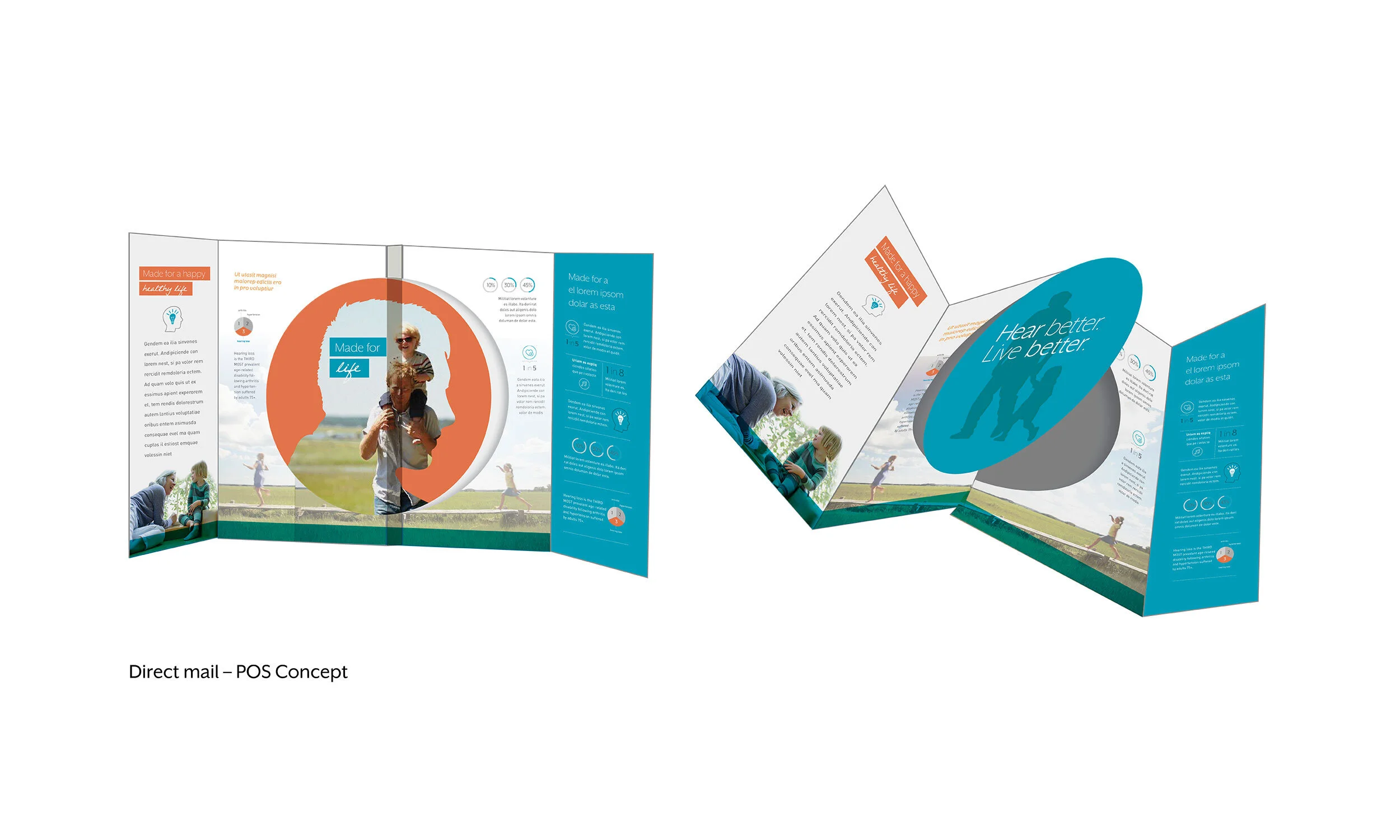
Creative approach: Around the time the Muse/Halo product line was produced, more reputable studies showcased that your quality of hearing was directly connected to your overall wellbeing. We started leveraging those facts and figure to create infographics that showed people how their hearing is connected to balance, cognition, heart health, diabetes and more.
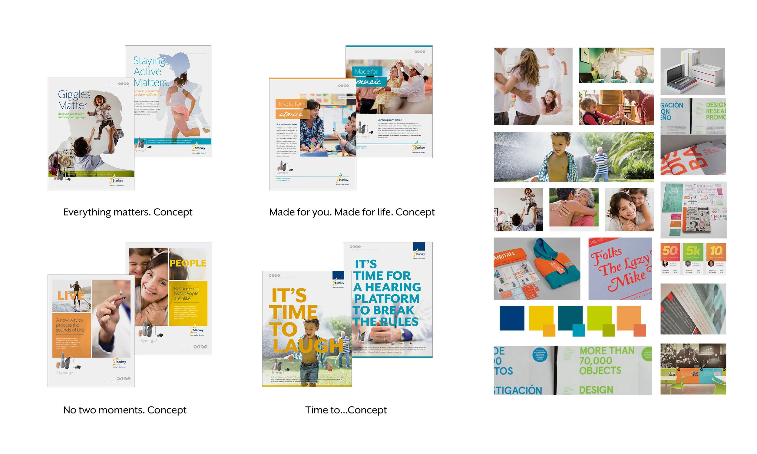
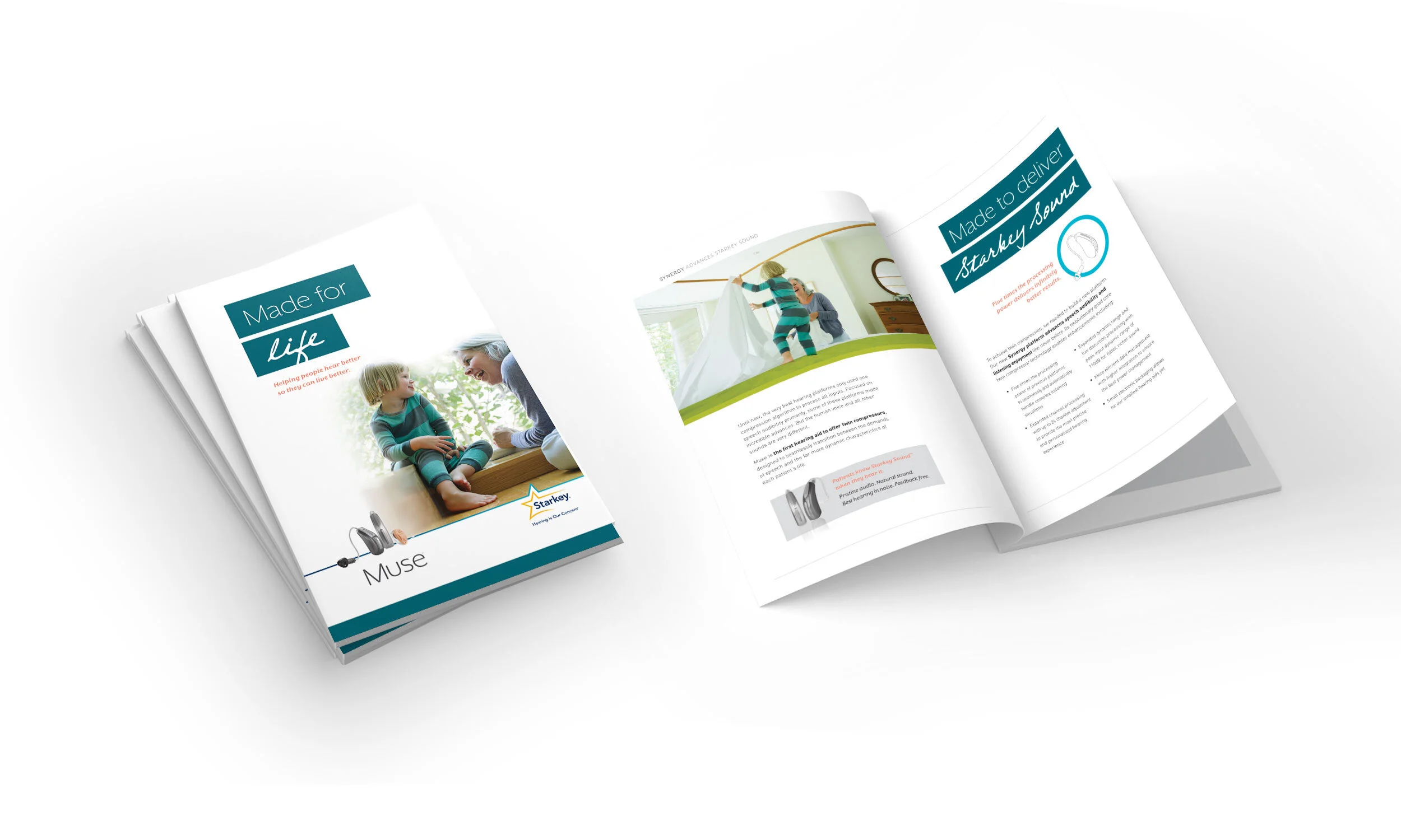
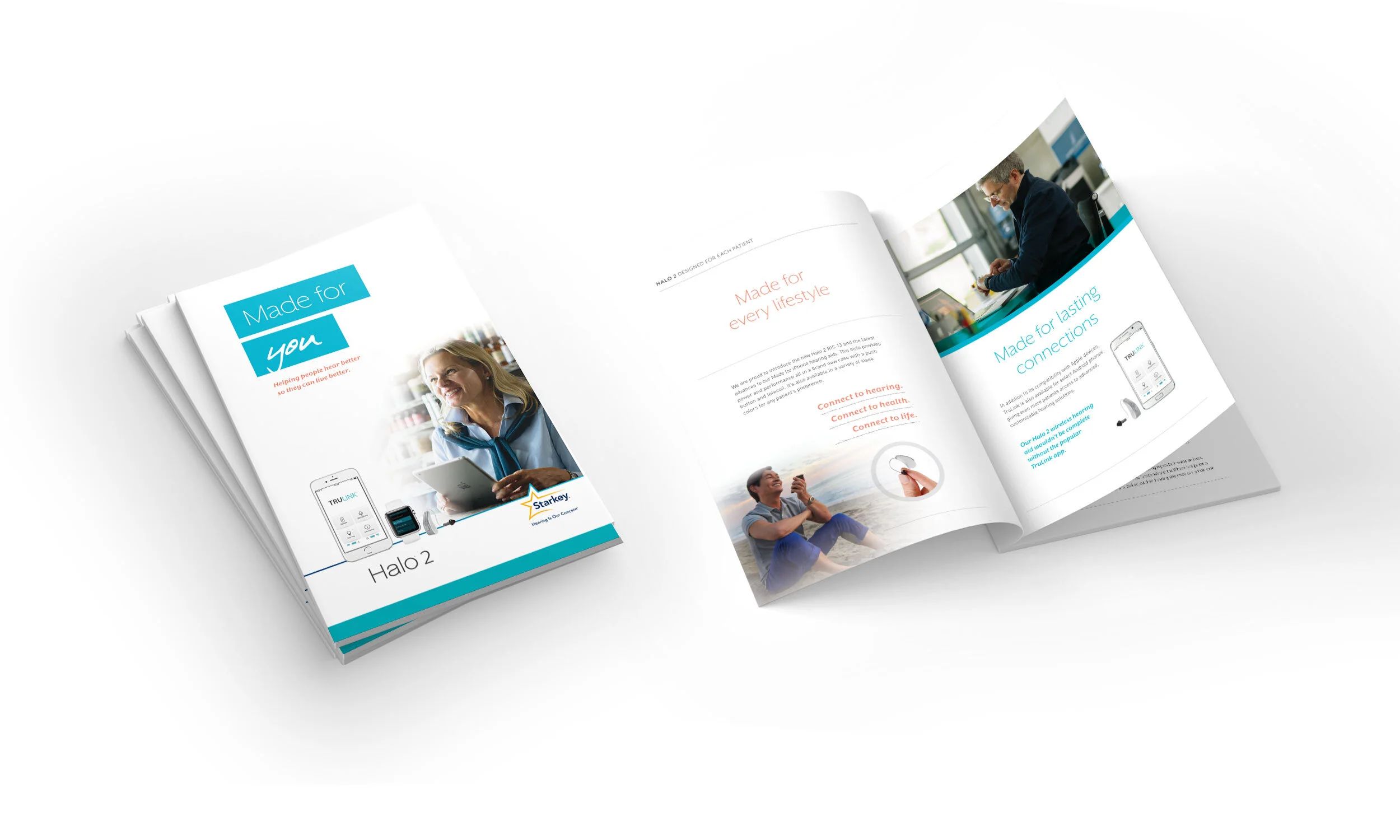
Campaign: Muse was launched in tandem with Halo. Our campaign was called, “Made for you. Made for life.” By capturing the essence of everyday moments—playing with your grandchildren, sitting down to play the piano—this concept highlighted how important your hearing is to be completely present.
Photography: To pay off this concept, we decided to shoot in Boston. We wanted the photography to portray an authentic connection and ensure it didn’t come across as if it were staged. To do this, we worked to cast family members (grandma & grandson), so their comfort level with one another was authentic. Over the course of five days, we shot in 6 locations throughout Boston with over 30 talent. It was a joy to art direct, produce and organize something of this magnitude and scale.
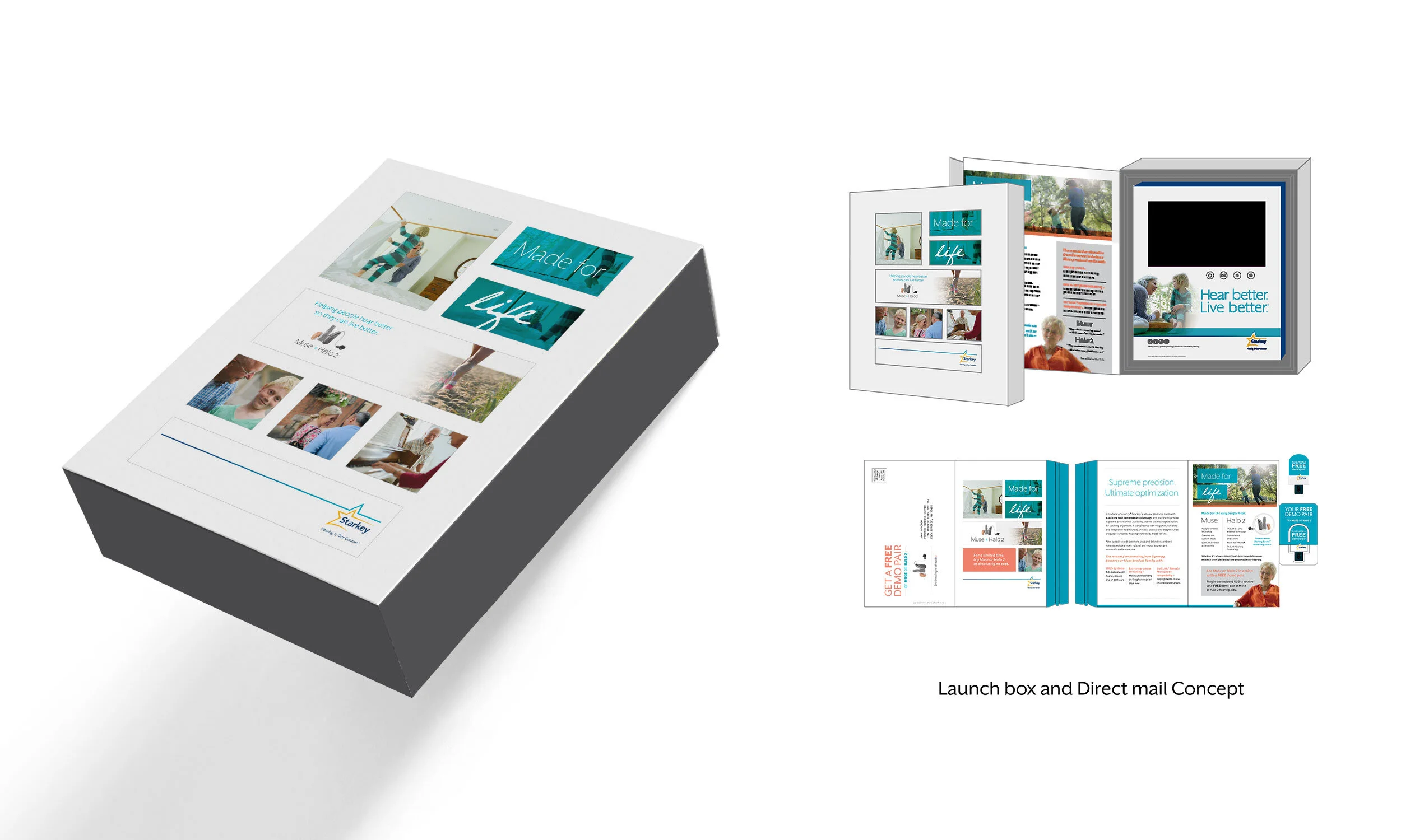
Launch materials: Many hearing professionals we work with are in competition with one another. Because of that, Starkey sells its hearing aid products under six different brands. Even with this additional design work, the Muse launch box was very cost-effective. It was up to the creative team to produce a box that could work for every brand. Together, we were able to concept a common container for all six brands that utilized windows to give each brand a unique inside cover by displaying unique printed inserts. For all launch materials we used the photography as a large component to showcase the “moments” in life you don’t want to miss. We developed a color palette that used our Halo teal and brought in new pops of color, including a florescent orange (which was MAGICAL in print). We also used a handwritten font to instill feelings of organic, personal connection.
Assessment: Overall, we received many compliments on our heart-felt authentic approach. The video was widely used and enjoyed by many. In terms of print design, we did run into issues with the handwritten font when it came to our global translations and this created some inefficiencies.


